
 Portal
Log in
Latest topics
» Chatbox Topic
by Ange Tuteur Fri 7 Jul - 14:27:44
» Demo Topic
by Ange Tuteur Sun 2 Jul - 13:15:14
» test
by Ange Tuteur Sat 1 Jul - 10:57:27
» test rchat
by Ange Tuteur Sat 24 Jun - 18:43:02
» testing new topic
by Deux Wed 14 Jun - 13:12:21
» bbcode test
by Ange Tuteur Sat 3 Jun - 14:24:35
» New chat
by Ange Tuteur Thu 1 Jun - 11:23:03
» GIFs
by Ange Tuteur Sun 28 May - 21:51:50
» random test chat
by Guest Sun 28 May - 20:04:09
Top posters
Statistics
We have 16 registered users
The newest registered user is mybeautiful9
Our users have posted a total of 611 messages in 47 subjects
The newest registered user is mybeautiful9
Our users have posted a total of 611 messages in 47 subjects
Who is online?
In total there is 1 user online :: 0 Registered, 0 Hidden and 1 Guest
None
Most users ever online was 166 on Sun 11 Apr - 20:29:53
None
Most users ever online was 166 on Sun 11 Apr - 20:29:53
Top posting users this week
Suggestions / Feedback
Page 6 of 15 • Share
Page 6 of 15 •  1 ... 5, 6, 7 ... 10 ... 15


- Ange Tuteur
 Developer
 -

Posts : 403
Reputation : 28
Join date : 2014-03-10 -


 Ange Tuteur Fri 3 Jun - 10:56:32
First topic message reminder :
Since this is a theme design forum, it'd be a good idea to open a topic like this for discussion. So, if you have any feedback or suggestions on the theme that's currently being developed here feel free to let me know below.
Since this is a theme design forum, it'd be a good idea to open a topic like this for discussion. So, if you have any feedback or suggestions on the theme that's currently being developed here feel free to let me know below.
Last edited by Ange Tuteur on Mon 13 Jun - 12:51:41; edited 1 time in total
- RhinoMember
- Posts : 23
Reputation : 14
Join date : 2016-05-30
Rhino Sun 3 Jul - 4:29:44
Now that's what I'm talking about babeh! XD nice and responsive! Works well! Keep it up!  will derp around and post some suggestions to the view later
So far what I noticed is that ads on some pages extend past the width. Viewing or editing profile for example.
Also I'd suggest keeping some stuff side by side better instead of in a straight line.
Topic icons legend for example.
Also the button row on sceditor in quick reply doesn't stretch fully. Seems like unnecessary spacing there.
Also last thing the back to top button would be nicer floating on the sides.
- Ange TuteurDeveloper
-
Posts : 403
Reputation : 28
Join date : 2014-03-10 -
Ange Tuteur Sun 3 Jul - 19:24:19
Going good, responsiveness is coming along nicely and I only sleep on the job at night.BlackScorpion wrote:BlackScorpion keeps staring at his watch
Sooooo.... How goes it?I see you been
on the job again.
There's plenty of tutorials out on the net that teach the web languages. W3Scools is your bible.
The recommended path of learning is HTML > CSS > JavaScript for front-end web development. The first two are easy to learn and essential for creating and designing your webpage. JavaScript on the other hand is a full-fledged programming language, so it can be difficult to learn for first-time programmers. It'll take a lot of free time to learn everything though.
Good to hear ! I'm a noob to this responsiveness stuff, so I'm learning as I go along.Rhino wrote:Now that's what I'm talking about babeh! XD nice and responsive! Works well! Keep it up!
So far what I noticed is that ads on some pages extend past the width. Viewing or editing profile for example.
Also I'd suggest keeping some stuff side by side better instead of in a straight line.
Topic icons legend for example.
Also the button row on sceditor in quick reply doesn't stretch fully. Seems like unnecessary spacing there.
Also last thing the back to top button would be nicer floating on the sides.
I agree with the majority that you mentioned. I plan to take a look over this stuf sometime after my holiday.
- BlackScorpion
 Member
 - Posts : 62
Reputation : 23
Join date : 2016-05-29
BlackScorpion Tue 5 Jul - 2:23:55
Ange Tuteur wrote:Going good, responsiveness is coming along nicely and I only sleep on the job at night.BlackScorpion wrote:BlackScorpion keeps staring at his watch
Sooooo.... How goes it?
There's plenty of tutorials out on the net that teach the web languages. W3Scools is your bible.
The recommended path of learning is HTML > CSS > JavaScript for front-end web development. The first two are easy to learn and essential for creating and designing your webpage. JavaScript on the other hand is a full-fledged programming language, so it can be difficult to learn for first-time programmers. It'll take a lot of free time to learn everything though.
I think i should invest some time on them, since it seems i using them more and more..
- Ange TuteurDeveloper
-
Posts : 403
Reputation : 28
Join date : 2014-03-10 -
Ange Tuteur Tue 5 Jul - 20:39:21
Thanks for this ! The adverts should be fixed. I noticed that they were clipped on other pages so I added a horizontal scrollbar so you can see the whole ad. Let me know if everything's okay on your end.Rhino wrote:So far what I noticed is that ads on some pages extend past the width. Viewing or editing profile for example.
At first I thought it was a good idea, but looking at it now it causes some unnecessary scroll. I tried to share the width between each icon as 50%, let me know if that improves it.Rhino wrote:Also I'd suggest keeping some stuff side by side better instead of in a straight line.
Topic icons legend for example.
I'm going to do a full look over the sceditor tomorrow. I have to tackle drop downs and stuff, and I'll look into this as well.Rhino wrote:Also the button row on sceditor in quick reply doesn't stretch fully. Seems like unnecessary spacing there.

I added a "top" and "bottom" button to the quick navigation. Do you think that'll be good ?Rhino wrote:Also last thing the back to top button would be nicer floating on the sides.
If you've got the time I say do it.BlackScorpion wrote:I think i should invest some time on them, since it seems i using them more and more..
- RhinoMember
- Posts : 23
Reputation : 14
Join date : 2016-05-30
Rhino Wed 6 Jul - 2:51:18
Yes! Learn it @blackscorpion
And yes the ads are now fixed!
I guess the up/down buttons work in quick navigation. Not distracting to anyone.
Also I have another suggestion what if you keep a link to notifications somewhere in mobile mode? Like it's just there showing the number and pressing it takes you to the full notifications page. Would be nice.
And yes the ads are now fixed!
I guess the up/down buttons work in quick navigation. Not distracting to anyone.
Also I have another suggestion
- Ange TuteurDeveloper
-
Posts : 403
Reputation : 28
Join date : 2014-03-10 -
Ange Tuteur Thu 7 Jul - 12:54:34
Perfect !
Good suggestion, because mobile users cannot see the fa toolbar. ( it's too buggy at low res ) I added a link to the quick nav for the notifications, for everyone actually.
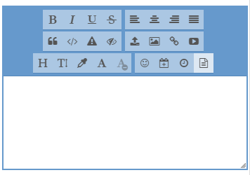
In regards to the SCEditor, I reworked most of the drop downs so that they're fixed to the bottom of the screen. Keeps them from overflowing and getting away from the user's viewpoint. Lemme know if that causes any problems. Also, about your suggestion, were you talking about this spacing ?
Good suggestion, because mobile users cannot see the fa toolbar. ( it's too buggy at low res ) I added a link to the quick nav for the notifications, for everyone actually.
In regards to the SCEditor, I reworked most of the drop downs so that they're fixed to the bottom of the screen. Keeps them from overflowing and getting away from the user's viewpoint. Lemme know if that causes any problems. Also, about your suggestion, were you talking about this spacing ?
- RhinoMember
- Posts : 23
Reputation : 14
Join date : 2016-05-30
Rhino Fri 8 Jul - 1:19:40
Pretty sweet drop downs! Very user friendly.
And yes that's the spacing I'm talking about.
- Ange TuteurDeveloper
-
Posts : 403
Reputation : 28
Join date : 2014-03-10 -
Ange Tuteur Fri 8 Jul - 13:55:07
A lot better than clipping off the screen, no ? 
Alright ! I have a few ideas for that, for starters what do you think about making the buttons scrollable ? ( e.g. swipe the screen to move through the buttons, scroll )
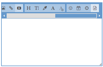
Another solution would be to try and make each group have an equal distance and width between each other.
I think the first one might be best, but lemme know what you think or if you have any ideas.
Alright ! I have a few ideas for that, for starters what do you think about making the buttons scrollable ? ( e.g. swipe the screen to move through the buttons, scroll )
Another solution would be to try and make each group have an equal distance and width between each other.
I think the first one might be best, but lemme know what you think or if you have any ideas.
- BlackScorpionMember
- Posts : 62
Reputation : 23
Join date : 2016-05-29
BlackScorpion Fri 8 Jul - 21:23:25
Ange Tuteur wrote:A lot better than clipping off the screen, no ?
Alright ! I have a few ideas for that, for starters what do you think about making the buttons scrollable ? ( e.g. swipe the screen to move through the buttons, scroll )
Another solution would be to try and make each group have an equal distance and width between each other.
I think the first one might be best, but lemme know what you think or if you have any ideas.
I'm like with the first idea, scrollable buttons.
- Ange TuteurDeveloper
-
Posts : 403
Reputation : 28
Join date : 2014-03-10 -
Ange Tuteur Sat 9 Jul - 14:29:53
Yeah, I'm thinking it might be better than having the buttons wrap to another line. I added it in so you can get a feel for it. It should display at 0 - 768px window width.
- Sponsored content
Sponsored content
Page 6 of 15 • 1 ... 5, 6, 7 ... 10 ... 15

Create an account or log in to leave a reply
You need to be a member in order to leave a reply.
Page 6 of 15
Permissions in this forum:
You cannot reply to topics in this forum|
|
|