
 Home
HomeLog in
Latest topics
» Chatbox Topic
by Ange Tuteur Fri 7 Jul - 14:27:44
» Demo Topic
by Ange Tuteur Sun 2 Jul - 13:15:14
» test
by Ange Tuteur Sat 1 Jul - 10:57:27
» test rchat
by Ange Tuteur Sat 24 Jun - 18:43:02
» testing new topic
by Deux Wed 14 Jun - 13:12:21
» bbcode test
by Ange Tuteur Sat 3 Jun - 14:24:35
» New chat
by Ange Tuteur Thu 1 Jun - 11:23:03
» GIFs
by Ange Tuteur Sun 28 May - 21:51:50
» random test chat
by Guest Sun 28 May - 20:04:09
Top posters
Statistics
We have 16 registered users
The newest registered user is mybeautiful9
Our users have posted a total of 611 messages in 47 subjects
The newest registered user is mybeautiful9
Our users have posted a total of 611 messages in 47 subjects
Who is online?
In total there is 1 user online :: 0 Registered, 0 Hidden and 1 Guest
None
Most users ever online was 166 on Sun 11 Apr - 20:29:53
None
Most users ever online was 166 on Sun 11 Apr - 20:29:53
Top posting users this week
Suggestions / Feedback
Page 5 of 15 • Share
Page 5 of 15 •  1, 2, 3, 4, 5, 6 ... 10 ... 15


- Ange Tuteur
 Developer
 -

Posts : 403
Reputation : 28
Join date : 2014-03-10 -


 Ange Tuteur Fri 3 Jun - 10:56:32
First topic message reminder :
Since this is a theme design forum, it'd be a good idea to open a topic like this for discussion. So, if you have any feedback or suggestions on the theme that's currently being developed here feel free to let me know below.
Since this is a theme design forum, it'd be a good idea to open a topic like this for discussion. So, if you have any feedback or suggestions on the theme that's currently being developed here feel free to let me know below.
Last edited by Ange Tuteur on Mon 13 Jun - 12:51:41; edited 1 time in total
- Ange TuteurDeveloper
-
Posts : 403
Reputation : 28
Join date : 2014-03-10 -
Ange Tuteur Fri 1 Jul - 21:35:03
I currently have the two media queries setup for 0 to 620px, and 621 to 1024px. I may change the maximum for the latter though, because that was just an estimate. 
So far I've been working on the first media query, so I haven't added many rules to the second one yet beside my little helper to know what query I'm on lol. Currently this is how the forum looks for the first media query :
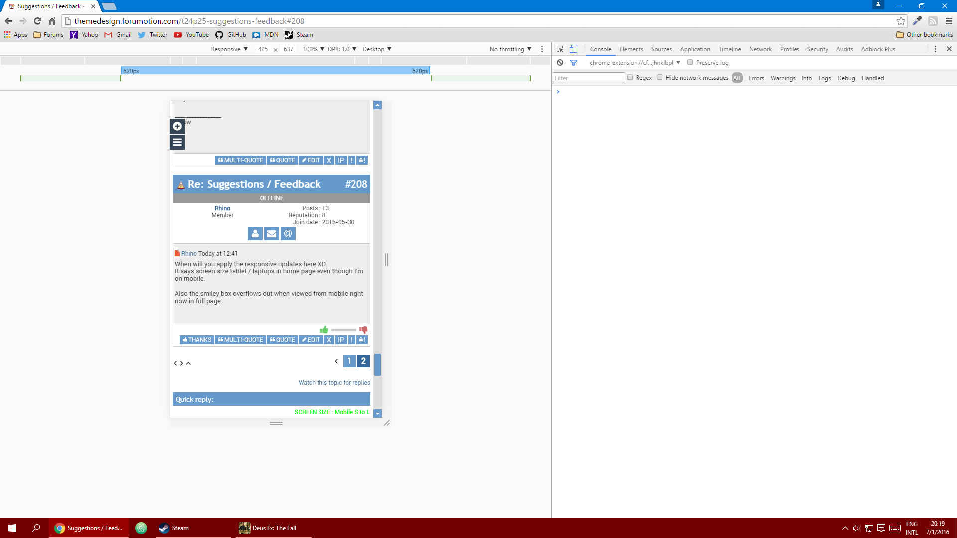
You can also see the ranges at the top :
blue = first query, min 0 max 620
green = second query, min 621 max 1024
Chromes tools are nice for responsive design...
Do you know how big the screen is on your device ? Because if it's within the first range it should show the "Mobile S to L" query
Thanks for the tip off about the smiley box btw, I still need to clean up some of the pesky editor elements.
So far I've been working on the first media query, so I haven't added many rules to the second one yet beside my little helper to know what query I'm on lol. Currently this is how the forum looks for the first media query :
You can also see the ranges at the top :
blue = first query, min 0 max 620
green = second query, min 621 max 1024
Chromes tools are nice for responsive design...
Do you know how big the screen is on your device ? Because if it's within the first range it should show the "Mobile S to L" query
Thanks for the tip off about the smiley box btw, I still need to clean up some of the pesky editor elements.
- RhinoMember
- Posts : 23
Reputation : 14
Join date : 2016-05-30
Rhino Sat 2 Jul - 3:59:40
Well yeah my device is like 360px width. I'm not sure why it isn't triggering the media queries. :/
On which phones did you try it yourself?
On which phones did you try it yourself?
- Wilson K.Member
- Posts : 7
Reputation : 3
Join date : 2016-06-01
Wilson K. Sat 2 Jul - 7:25:36
That was fast xd I was actually looking for a way too, now you gave it, thank you 
The red bar above your name though, it looks like it's giving off a warning ;p
The red bar above your name though, it looks like it's giving off a warning ;p
- RhinoMember
- Posts : 23
Reputation : 14
Join date : 2016-05-30
Rhino Sat 2 Jul - 8:39:17
Also I tried from chrome's responsive mode but I still see the forum normally in all widths...
- Wilson K.Member
- Posts : 7
Reputation : 3
Join date : 2016-06-01
Wilson K. Sat 2 Jul - 8:42:38
The only problem with the responsiveness is the images, it loses its quality.
- Ange TuteurDeveloper
-
Posts : 403
Reputation : 28
Join date : 2014-03-10 -
Ange Tuteur Sat 2 Jul - 12:49:29
Hmm.. I'll have to look into that somehow..Rhino wrote:Well yeah my device is like 360px width. I'm not sure why it isn't triggering the media queries. :/
On which phones did you try it yourself?
None, sadly I don't have a smart phone -- I'm a poor dev, a result of my selflessness and individual pursuits.

Try switching the mode from "mobile" to "desktop", because for some reason the mobile mode is zoomed out.. not sure why. Perhaps that's something I'll need to look into as well.Rhino wrote:Also I tried from chrome's responsive mode but I still see the forum normally in all widths...
 I am a virgin to this whole responsiveness thing.
Oh you might need to go to the little dots on the top right, and choose "add device" so it shows the drop down.
lol yeah, that's the group color. I'll probably change it on my main forum to something of lower saturation when I switch themes.Wilson K. wrote:The red bar above your name though, it looks like it's giving off a warning ;p
That can't be helped. The smaller the screen, the smaller the image -- I can't have it overflowing the containers and causing unnecessary scroll. Luckily the options bar should still function properly.. right ?Wilson K. wrote:The only problem with the responsiveness is the images, it loses its quality.
- RhinoMember
- Posts : 23
Reputation : 14
Join date : 2016-05-30
Rhino Sat 2 Jul - 16:30:56
May I ask how exactly are you doing it? I might be able to help.
- Ange TuteurDeveloper
-
Posts : 403
Reputation : 28
Join date : 2014-03-10 -
Ange Tuteur Sat 2 Jul - 22:10:41
Viewing and testing the responsiveness ? There's two methods :

- Resize the browser window
- Use a responsive design mode. ( Webkit browser and Firefox have these )
Press CTRL+SHIFT+C to open the console, then click "toggle device toolbar". After this click the dots in the corner and choose "add device type" then choose desktop, 'cause "mobile type" looks zoomed out.
- Ange TuteurDeveloper
-
Posts : 403
Reputation : 28
Join date : 2014-03-10 -
Ange Tuteur Sat 2 Jul - 22:30:26
Nevermind you shouldn't need to use "desktop" as the device type anymore. I figured out the problem, I needed to include a meta tag for the viewport in the head section. This :
Lemme know if the responsiveness works for you on mobile now, Rhino.
- Code:
<meta name="viewport" content="width=device-width, initial-scale=1" />
Lemme know if the responsiveness works for you on mobile now, Rhino.
- BlackScorpion
 Member
 - Posts : 62
Reputation : 23
Join date : 2016-05-29
BlackScorpion Sun 3 Jul - 0:01:53
BlackScorpion keeps staring at his watch
Sooooo.... How goes it?
I see you been  on the job again. Too bad i'm not a coder , would love to help out and learn some shit.
 - Sponsored content
Sponsored content
Page 5 of 15 • 1, 2, 3, 4, 5, 6 ... 10 ... 15

Create an account or log in to leave a reply
You need to be a member in order to leave a reply.
Page 5 of 15
Permissions in this forum:
You cannot reply to topics in this forum|
|
|